Credit where credit is due — football kit designers have been putting in the extra hours and working overtime this season, if the sheer number of ultra-stylish shirts that are still being released is anything to go by.
Let’s face it, everybody loves a cool football kit, and many of you went all dewy-eyed for our first selection of the best kits on the planet back in September.
Since then, we’ve seen a load more gorgeous jerseys released by clubs and national teams across the world, so we felt it only right to curate and present you with a second batch.
This fresh collection is every bit as good, with a variety of home, away, third alternate and special-edition shirts on offer.
Presented in alphabetical order, here are even more of the most stylish shirts on offer for the 2024-25 season.
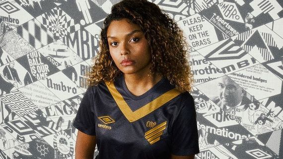
When it comes to timeless colour combinations, deep navy and gold never fails to look anything other than regal. Throw in a classic chevron and a scattering of tasteful retro touches like manufacturer Umbro’s heritage diamond logo, and this kit is on point.
A smoky grey shirt that complements Bari’s gorgeous 2024-25 outfield set perfectly, the new third kit features subdued tonal badges and a graphic that is inspired by the precious, sixth-century floor mosaics found inside the Cathedral of San Sabino. The metallic colourway is also a visual reference to the silver-plated portraits found at the Basilica of Saint Nicholas, which is also set in Bari’s old town district.
Released to mark the club’s formation in 1904, Leverkusen have created a modernised reworking of the black home kit they wore during their early years complete with their historic crest, a red collar and yellow buttons (which originally ran all the way down the front of the jersey). Unlike the majority of special-edition designs, Leverkusen’s has also seen proper action with both the men’s and women’s teams wearing it during recent Bundesliga outings.
Created in collaboration with fashion model Lena Gercke, Bayern’s women’s team released a special kit that they played in last month as part of the annual Breast Cancer Awareness campaign. The shirt has a quirky harlequin pattern in various shades of pink and the numbers on the back are decorated with the pink ribbon logo that has become synonymous with the charity.
Brisbane Roar have waltzed into their 20th A-League season as a club with three excellent kits, and the pick of the bunch is the maroon and cream checkerboard away jersey. Designed by the club’s inaugural captain, Chad Gibson, it’s the small details that make this shirt so good — like the maroon checks actually made up of tiny little versions of the lion from the club crest.
Kappa have barely put a foot wrong this season and their new kit for Brazilian side Clube Atlético Juventus is no exception. Extra smart in off-white and burgundy with a fine diagonal pinstripe, the jersey also carries the team’s original club crest from when they were still known as Cotonificio Rodolfo Crespi Futebol Clube. They made their name a little snappier in the 1930s, but the old crest deserves a fresh airing.
Presented as a tribute to their home city of Glasgow, the Braves’ new home and away kits feature a repeating fractal pattern that is inspired by tartan and by the work of famed architect and designer Charles Rennie Mackintosh, whose art and craft can be found right across the Scottish city. Both are lovely in their own right, but the blue home jersey narrowly stands out more.
Cambodia’s national team have been furnished with a clutch of new kits that all follow the same theme and each bear a woven repeating pattern that is inspired by the aerial view of the five central towers of the Angkor Wat temple, the iconic UNESCO World Heritage Site that has stood since the 12th Century. Once again, the dark blue home kit is probably the standout, although the light-blue away and obsidian-black goalkeeper versions are both excellent.
Another special-edition shirt that has proven to be an instant smash among kit connoisseurs, Colombia’s centenary design is based on the kit worn by Los Cafeteros at the South American Championship in 1945. The tricolor design has been revived several times since but never has it looked quite so elegant, and the decision to rope in legendary goalkeeper René “Scorpion Kick” Higuita to star in the launch video was the icing on the cake.
Poland’s most successful club have used their traditional colours of red, white and green to create a gorgeous tricolour shirt that might have made a fantastic Italy or Mexico national team jersey in an alternate universe. Along with ice white trim, the design is split into three bold blocks of colour that resemble the large flags waved by supporters at the club’s stadium on matchdays.
Another world-class effort from Kappa, who took the idyllic waters of the Gulf of Spezia as inspiration for the local football team’s suitably aquatic third shirt. So vivid that you can almost see the sun glinting off the clear, blue seas as they lap lazily against the western Italian shores.
Italian clubs have dominated this selection, so it’s fitting to round it off with Udinese’s new third jersey. The specific pastel shade is listed as “light wisteria” and the graphic is intended to resemble white smoke rising slowly through the evening sky. We have no idea why, but we love it all the same.


